Discussing the Progression of my Art Style.
The Nythim art Style.
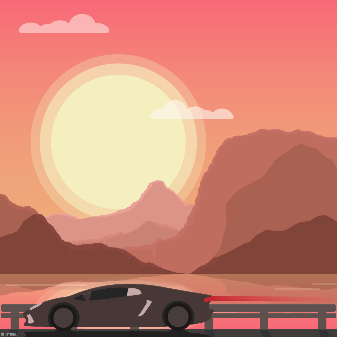
At the end of the first year I made it my goal to get better at software like adobe illustrator during the break to further develop my skills, but also attempt to create a style that I could consistently work with and expand upon comfortably. Eventually I came up with a Minimal style that uses line art and minimal colour to create futuristic and cyberpunk inspired art. Majority if not all of my art in this style is posted on my Instagram account. Below is an example of my current art style.

Trace Image Designs:
However it took me quite a bit of developing and experimentation for my artwork to become what it is today. When I started using illustrator on a daily basis, a lot of my artwork featured a variety bright colours in comparison to how I work now. The first style I worked with focused heavily on the trace image tool, using this tool on images in PNG format I created minimal pieces of characters from video games. The tool would trace the colour and shapes giving a blotchy paint look as an outcome, I usually had the trace setting to three colours to keep the colour palette to a minimum resulting in the design being simplistic but still have a level of detail that you could determine who the character was in the design. This process was rather quick, I would spend an average of 10-20 minutes adjusting and editing the traced shapes to neaten up the designs. Although this style got to a point where I was creating and selling prints and even contributing to a local art exhibit where I showcased multiple designs in this style, I became rather bored and eventually disapproving of it because it was essentially tracing over an images. I didn't feel like I was improving with my illustrator skills and I yearned for something different and more challenging. Below is two examples that I created using the trace image tool.
T-45 power armour from the Fallout game franchise

Pilot from the Titanfall games

Vector Art:
The next style I started to experiment with was a lot more colourful and shape orientated. using tutorials I found on YouTube I started to create cutesy designs. These tutorials helped me achieve a better understanding of specific tools and how they worked, a tool in particular is the pathfinder tool, this tool was always overlooked when I designed stuff, now I religiously use it on almost every design. These vector designs varied from objects like a cactus or a cup of coffee to landscape designs that featured a sun or a moon emitting a spherical glow. This style also helped me develop my skills in shape manipulation using the pen tool and the direct select tool, as I progressed I saw myself create more interesting designs with different perspectives.
Shortly after, the dimensions of my illustrator canvas size changed to 1600 x 1600 pixels to accommodate Instagram's square sizing for posts. This hasn't changed since and all of my designs either use 1920 x 1080 or 1600 x 1600 depending on what the design is intended for. Additionally I purchased the royalty to a font called Leixo which occasionally appears in some designs, an example of this font is paired with a vector art piece I did of a coffee cup.
'Good Morning' Vector design created from following a YouTube video.

'Sunset Drive' One of my most well received pieces in this art style.
I enjoyed creating these designs and digital illustrations alike, it was at this point where I started to brand myself as both a graphic designer and illustrator. My vector art brought in a large fraction of my follower count on Instagram and I began getting commission work along side selling prints of my art, I even created business cards to hand out at networking events that featured my artwork on one side and had my contact information as well as my Instagram username on the other.

Isometric Art:
The isometric art style fascinated me and I always wanted to design something in this style to experiment with 3d perspective more, with the help of YouTube tutorials I learned how to create a grid which was vital for creating consistent isometric designs. I only worked with this style for about a week and a half because I personally didn't enjoy designing pieces as much as i thought I would I found it somewhat tedious creating boxes over and over again.
Overall I created 4 isometric pieces mostly being landscape designs which are shown below, each design had small bits of detail that were experimentation like glow effects which can be seen on the lava design, or shadows to give a feeling of depth on the floating island design.
'Floating paradise' The first of my isometric designs

'Lava World' Created to experiment with gradients to create glow and shadow effects

'Slime land' A design experimenting with a more vivid and cartoon colour palette

'Isometric Living Room' This design was my most detailed isometric piece experimenting with shadows based on a light source and adding little details like books and even a wire to the television set, it was at this point where I started to lose interest in this style and move onto the beginning of what became my current art style.

Line Art:
My current art style took a variety of inspirations before it became what it is today, the first inspiration was IKEA manuals in how they use minimal black and white line art for their illustrations, there is a lack of detail in the design but it perfectly conveys the important information which is how to build the product.

The next inspiration was star constellations and dot to dot artwork. using my skull helmet as base of design I outlined an image I took of the skull. This is also where a lot of my assets that are seen in my current art style were created, assets such as crosses, dashed lines and the coloured ring became a staple element to my designs giving a more 3 dimensional effect.

Shortly afterwards I created an asset sheet containing shapes and colours to help me consistently design pieces on a daily bases, the sheet consisted of different gradients for the accent colour and various shapes, line strokes and opacity that are used in every design The main colours of the design are a light grey background set at the hex code E6E6E6, and a dark grey set at 1A1A1A. The reason behind this was because I used to find working long periods on a white canvas straining on my eyes so I would usually change the background colour to a light grey to help. This eventually became a design choice because I preferred the contrast of light and dark grey to black and white. below is a screen shot of this asset sheet.

The art style focuses on straight lines for the main design to give this low poly effect, the only curved lines you would see in this style would be the coloured ring it self and a couple circle assets surrounding the design. At first I created robotic animal head designs eventually working up to more detailed illustrations of video game characters and vehicles.
Cybernetic Elephant Design
when it came to the ring I experimented with the shape of the ring to see what worked best, overall a circular ring proved to be the most effective.

Genji Shimada from the game Overwatch

3D Depth Effect:
An interesting effect that I found whilst browsing online was the use of two white bars edited onto a video clip to give it a 3D effect with depth, I thought this was brilliant. In the edited GIF below of rocket raccoon from guardians of the galaxy, the two bars are edited over the background whilst the foreground object which in this case rocket and his gun extending is edited over the white lines giving this awesome effect.
I wanted to see if I could incorporate this style into my own work and with success I was able to create a feel of depth into some of my designs. an example of this is my first design for Inktober 2017 which is shown below.

Overall I am extremely pleased with how my art style has developed and evolved over the summer break. I'm glad that I have eventually been able to create a unique art style I can distinguish as my own I am strongly considering creating prints and t-shirt designs to sell online.
Finally I will be making an on going post for this blog where I will be uploading all none project designs in my style with an additional link to my Instagram account. You can find this link below.
Non Project Designs
Additionally I will be attempting to do the 2017 Inktober challenge, each day and design for that day will be documented onto this blog, you can find the link here.
2017 Inktober Challenge
Comments
Post a Comment