Process and Production: Exploring Geometry with Sara Nesteruk.
Exploring Geometry With Sara Nesteruk
For the first Process and Production workshop of the second year. I joined Sara Nesteruk's group with motion graphics due to my initial tutor nick being absent. The group revisited Adobe After Effects to help familiarise the class with the application since the previous year. A long summer without using After Effects personally has made me a little rusty with the software.
The task for this weeks workshop is to create a small 10 second video consisting of 7 different animated assets each lasting 1 second and a 3 second end board to finish off the video. Sara Showed us a video by Steffen K called '30 motion tests in 30 seconds' where Steffen created a 1 second animation every day for a month, using Adobe After Effects and Cinema 4D as a way to experiment with different animations and styles. This was a great example on how we can approach this weeks task.
To begin with we were tasked with creating a variety of assets on illustrator that can be imported onto After Effects to work with. My personal art style consists of simple minimal shapes such as triangles circles and lines to create line art inspired by minimalism and the Sci-fi genre of cyberpunk. below is an example of my art style.
The art style uses a light and dark grey colour scheme with accents of a gradient such as greens and pinks, additionally the use of shapes that feature a negative space produce a minimal appeal to the design. I wanted to incorporate this style into motion graphics with the intention of being able to eventually create small animations and clips that i can include to my portfolio and my Instagram account.
Below are all the assets I have extracted and created in preparation for this workshop task.

Composition 1, lined transition:
The first composition we explored is creating a transition using the 'Venetian Blinds' effect. This effect basically cuts shapes into lines and linear wipes between them, this is a rather simple effect found in the transition options and applied to a layer of your choosing. The effect works rather well with my art style because a common asset that features in majority of my pieces, is a vertical stripe line pattern. This can be seen above as a triangular shape on the asset sheet created for this task.
Below is a GIF that I have created using After Effects and Photoshop as an example of this transition.

Composition 2, the wiggler expression:
The next composition that we looked at was the wiggler expression, this animation effect simply added a randomised wiggle to a chosen asset, resulting with the asset having a fidgety and somewhat unstable motion. I personally liked how it produced a jittery and glitchy appeal, I wanted to incorporate this into my 1 second composition with the intention of making the asset of my choosing shake rather violently to express the impression of the asset being unhinged.
I chose to work with the 'x' inside a black circle for this due to it being a rather solid shape with block colour. Additionally the expression added a sharp and spiky motion so the use of a shape that didn't have any edges or corners would make an interesting contrast.
Below is a GIF of this expression being used on the asset

Composition 3, the path wiggler:
A different approach to the wiggler expression was the path wiggler, this had the same effect as the previous composition but applied the effect to the path of the chosen asset whilst keeping it stationary. The intensity of the path wiggle can be adjusted to determine how fluid the effect becomes, again with the intention of making the asset of my choosing appear unhinged and unstable I experimented with high numbers ranging from 100-2400 to produce a really natural fracturing animation. An example of this can be seen below on a triangular asset.

The combination of the two expressions on a single asset could produce a really maniacal animation.
The art style uses a light and dark grey colour scheme with accents of a gradient such as greens and pinks, additionally the use of shapes that feature a negative space produce a minimal appeal to the design. I wanted to incorporate this style into motion graphics with the intention of being able to eventually create small animations and clips that i can include to my portfolio and my Instagram account.
Below are all the assets I have extracted and created in preparation for this workshop task.
Composition 1, lined transition:
The first composition we explored is creating a transition using the 'Venetian Blinds' effect. This effect basically cuts shapes into lines and linear wipes between them, this is a rather simple effect found in the transition options and applied to a layer of your choosing. The effect works rather well with my art style because a common asset that features in majority of my pieces, is a vertical stripe line pattern. This can be seen above as a triangular shape on the asset sheet created for this task.
Below is a GIF that I have created using After Effects and Photoshop as an example of this transition.
Composition 2, the wiggler expression:
The next composition that we looked at was the wiggler expression, this animation effect simply added a randomised wiggle to a chosen asset, resulting with the asset having a fidgety and somewhat unstable motion. I personally liked how it produced a jittery and glitchy appeal, I wanted to incorporate this into my 1 second composition with the intention of making the asset of my choosing shake rather violently to express the impression of the asset being unhinged.
I chose to work with the 'x' inside a black circle for this due to it being a rather solid shape with block colour. Additionally the expression added a sharp and spiky motion so the use of a shape that didn't have any edges or corners would make an interesting contrast.
Below is a GIF of this expression being used on the asset
Composition 3, the path wiggler:
A different approach to the wiggler expression was the path wiggler, this had the same effect as the previous composition but applied the effect to the path of the chosen asset whilst keeping it stationary. The intensity of the path wiggle can be adjusted to determine how fluid the effect becomes, again with the intention of making the asset of my choosing appear unhinged and unstable I experimented with high numbers ranging from 100-2400 to produce a really natural fracturing animation. An example of this can be seen below on a triangular asset.
The combination of the two expressions on a single asset could produce a really maniacal animation.
After Class Workshop: Motion Graphics Club Week 1
Sara runs an after class motion graphics club on Wednesdays for those who want to learn and work with motion graphics more. Additional workshops for motion graphics Is always a plus in my books so I decided to attend, due to it being the first week of the academic year the session was mainly an introduction and an icebreaker of quick fire questions in relation to motion graphics. The questions and my answers were as follows.
Quick fire questions:
1. I want to advance my skills in motion graphics to create minimal cyberpunk inspired animations
2. I want to make motion graphics combined with my art style
3. Motion graphics is new to me
4. This year I intend on improving my skill set
5. I'd like to produce motion graphics in my art style to broaden my portfolio
6. The first thing is learning the basics to Motion design
7. The next thing is to experiment possibilities with Motion design
8. The best thing is to consistently progress with motion graphics to improve my skillset9. I want to go to classes, events and sites that can improve my skill in motion graphics.
Ident
ʌɪˈdɛnt,ˈʌɪdɛnt/
noun
- short for identification, especially in informal or technical use.
- a short sequence shown on television between programmes to identify the channel.
A potential idea of a project during the motion graphics club, is for the class to create our own individual Ident pieces and to piece them together as a collaboration to create a small motion video showcasing all of our work.
We eventually decided on each creating a small 5 second animation introducing ourselves which would then be combined with others to create a small video. The 'deadline' for this would be for the next workshop which would be the following Wednesday.
Ideas for 5 second animation:
For my 5 second introductory animation I want something that can explode on screen with contrasting colour yet maintain a minimal appeal in design. I want the animation to be fast paced and yet clear enough for the viewers to see what is happening during the 5 second window i have to work with.
A brilliant example would be the the menu animations found in the game 'Persona 5', it features this comic-esque appeal which I absolutely adore, the contrast of the red background and accents paired with the black and white silhouette design of the character and text gives it this bold, visually appealing animation.
This menu sequence in particular has been a big inspiration for my art style, the minimal comic book feel primarily using black and white has always been a personal favourite when it comes to my own designs. Below is one of my more recent pieces that has taken inspiration from the Persona 5 menu sequence shown above.

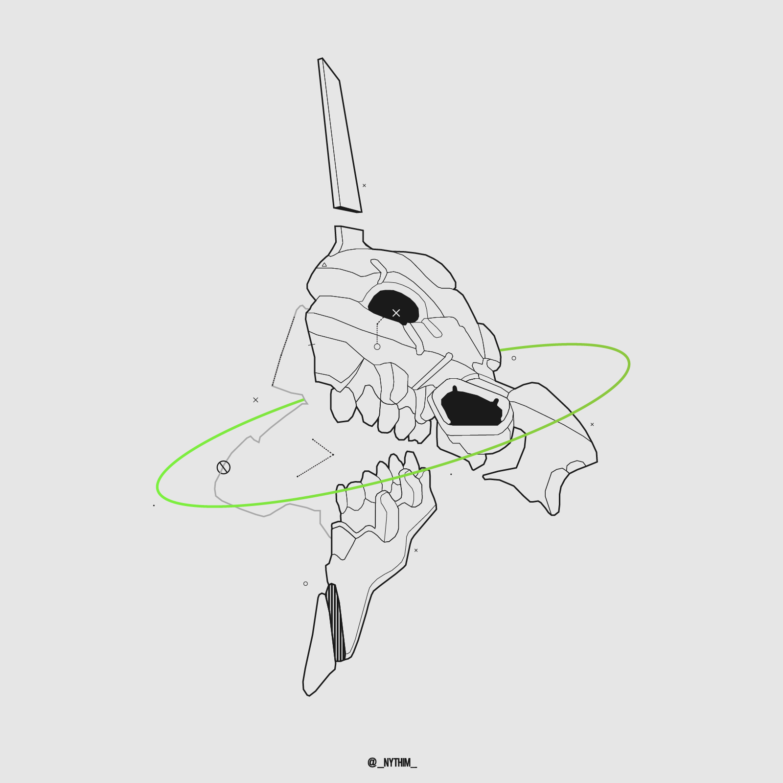
For my introduction I want to incorporate my character 'Nythim' into the animation. Nythim is an anonymous internet alias and identity used to showcase my artwork on social media such as Instagram, over the past year this identity has evolved into a character concept for the very same artwork. His design has a very comic book theme to it featuring unrealistic proportions especially with the arsenal of weaponry that he wields. This animation will be reusing assets from the design shown above.
Initial Frame design:
At the beginning of the animation, the character's head will turn to a specific position. the use of minimal frames with the addition of effects, the sequence will look like the character's movement is timed to a flash. Once it reaches the final position, the full design of the character will be added and the frame will stay in shot for the remainder of the animation. Below is an example of this sequence.

Additional frames and assets:
The insertion of an extra frame with the skull turning created a more fluid motion for the sequence. The transition between the frames were also slowed down due the initial sequence being a bit too fast paced for my liking.
Additionally I wanted to implement some motion into the gun, I created a small black rectangle that slowly moves, this makes the gun look like the chamber is sliding backwards and releasing a bullet casing. Next I added two bullet casing designs to help give the impression that the gun was shooting.

Finalisation:
The following day I completed the animation by having additional assets and details such as a gun flash alongside two black lines that produce a 3D illusion and create depth to the animation. This effect is more commonly used with motion media such as GIFs, however it can be applied to static imagery and design creating the same outcome. I will be discussing this effect and how i was able to implement it into my own art style on a later date.
Seeing that this animation is for an introductory video for the motion graphics club, I want to create some text that states my name and what I am studying. A particular effect that I enjoy, is when an asset rapidly moves to a specific position and during it's motion it changes to a much slower pace giving the effect of slow motion, this adds a nice touch to the animation but more importantly it allows the viewers to clearly read what the text says. For the design I took heavy inspiration from the game 'Persona 5', which features a very blocky, comic book-esque stabilisation and design. For the name I chose to use my alias of 'Nythim' because I intend on showcasing this on social media.
Overall I am rather satisfied of the outcome of this animation, being my first completed animation on Adobe after effects I was able to learn a lot of new tricks and shortcuts that will surely help me with future projects. Looking at it now I can see some mistakes like the colour of the gun and one of the bullet casings being slightly off, but other than that I can't see anything that requires major rework or adjustments.


Comments
Post a Comment